By Sachin Shenolikar
(The photo above is courtesy of the Xerox Historical Archives.)
We see it from the corner of our eye every time we log on to the Web. It’s the “hamburger symbol,” the three simple black bars at the top of a browser that resemble our beloved American sandwich. The button has a simple yet important purpose: It takes users to a secondary menu of applications on a computer.

Where did this icon originate? It was designed by Norm Cox of PARC for the Xerox Star workstation in the early 1980s — nearly a decade before the birth of the World Wide Web. That was a whimsical era at PARC, when developers were tasked with building a new way of interacting with computers. Remember, this was a time when most people outside of a lab didn’t know their way around a personal computer. One task for PARC researchers was to introduce new ways to navigate around machines.
“The challenge was daunting, but the creativity, the free exchange of ideas, and the opportunity to change the world was infectious,” says Cox. “The environment fostered both heated debate and way-cool collaboration and camaraderie. Cutting-edge thinking, innovative ideas, and Peet’s coffee flowed unabated through the halls and meeting rooms.”
The designers at PARC in those early days of personal computing had a near-blank slate to work on. However, one limitation that they faced was the simple hardware of the day. The display was only black and white and the resolution was just 72 pixels per inch. “The coarse, limited resolution tended to dictate very simple, clean designs for all the images,” says Cox. “That has proven to be one of the many hallmark successes of the UI [user interface], as evidenced by the trend back to minimalism and simplicity in today’s GUIs [graphical user interfaces].”
Mike Kuniavsky, a current researcher at PARC, is most impressed by the strategy that led to innovations such as the hamburger symbol. “The idea at the time was that if computers were easy enough for kids to use, then everyone else could use them, too” he says. “What we can learn from the early research is how they looked at problems. At the time they saw that one of the greatest needs was making computers comprehensible to a wide variety of people.”
Innovation Services from PARC:
Learn how PARC researchers use human-centered insights and ethnography to identify unmet needs, and recommend successful workflow practices.
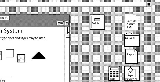
Burger Containers
The now famous icon wasn’t associated with a hamburger when it was first created. “We often referred to it — tongue in cheek — as ‘the air vent to keep the window cool,’” says Cox.
The idea for the icon developed from a need for a “container” with a list of command buttons that either didn’t fit in the header, related to window control rather than to the contents, or were unrelated to the current context of the cursor or selection within the window. In short, it was a button to see more menu options that were hidden from the main screen.
Cox says two symbols were considered for this button. One was a downward pointing arrow in the shape of a triangle representing the direction that the menu would appear. The developers decided that this symbol could be misinterpreted as a pointer for directional instruction.
The other symbol was the three-line “hamburger” image, which actually represented the look of stacked command buttons. “There was never a question as to how many lines it would be, since two lines looked like an equals sign and four were visually too many,” says Cox. “Three lines was the perfect number.”
How did such a simple design last for more than 30 years?
“The hamburger symbol’s longevity, as well as that of many other PARC images, is a testament to its simplicity, utility, learnability, and memorability,” says Cox. “At PARC, we quickly learned that there is no such thing as a perfect symbol to fit all users. About the best we could hope for is a simple, sensible, logical, learnable, and memorable symbol that becomes a part of our digital language and subconscious.”

A Move to Gestures
We are once again at a launching point for user interface design. Today, most people in the developed world know their way around a computer. They are reliant on different technology such as mobile devices and data storage in the cloud. Icons have become less relevant. App design has become more gestural than figurative — today’s equivalent to GUI icons are the “swipe right means yes” or “pinch to zoom” gestures.
Developers are also creating methods for people to interact with machine learning systems that behave autonomously and attempt to anticipate human behaviors.
Kuniavsky says these developments have created new questions. How do we make sense of the flood of data? How can we manage large collections of devices that are making decisions on our behalf? What does it mean to have simultaneous, perhaps different, identities in the cloud and in person?
“These questions have started to be lumped under the ‘user experience design’ umbrella,” he says.
“What user experience designers like me can learn from the early days,” Kuniavsky notes, “is how they were able to step away from their assumptions to understand the underlying problems and create technology that addressed people’s needs and desires.”
Subscribe to this blog and receive email updates when we publish a new article.